
Perhaps ten years ago; reporting risk profiles or organisational threats was a challenging thing to do for many risk analysts on the job and while the majority of risk reports were fundamentally ordinary, it became apparent quite quickly that a simple list of hazards was never going to cut it.
In this blog we look at an emerging era of risk reporting.
A decade or more of exploration in risk reporting has turned
out a set of popular reports which have been adopted as common practice. However, many of the seasoned risk practitioners today
are looking to take their risk reporting systems to the next level.
A recent discussion on the ISO Linked-In G31000 forum is
particularly fascinating and focuses on the worthiness of the Probability Impact Matrix (PIM). The PIM as it is often better known, is a fantastic
invention from the past but today, it is being depicted as a necessary evil. All this aside, it still makes up the basic foundation for the risk reporting toolkit used by risk managers today.
So where do we go to from here?
Well, one of the seasoned ISO 31000 analysts suggested Bubble Charts are an improvement on the PIM but in reality how easy are they to generate?
The answer to that question depends on which tool you select for generating the bubble chart. Risk people today are using reports such as the risk dashboard, the PIM, the heat map and the control self-assessment traffic light report but these risk reports have been proven to be erroneous and are begging for evolution.
None the less, let’s take a look at our Bubble Chart:
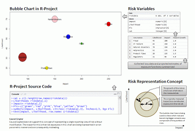
As you can see, a very small amount of R-Project source code resulted in generating a nice Bubble Chart and it did this from a single risk data set. However, the Bubble Chart as an attempt to report risk exposure is flawed when it is used to show exposure values as a single consolidated report.
Why?
Risk measures, actually nearly all measures of just about anything are trapped in the realm of probability, whether we like that fact or not. When you measure something unknown, often something known that is variable, there is no precise answer. What we end up with at best is a measured trajectory of potential and generalized estimate of loss.
Here is an example: If you were to assess the width of a piece of paper, that measure has standard error. The ruler may not be accurate, the piece of paper is a single sample which has been manufactured and the manufacturing process is likely to be laden with inaccuracy and so on, the list of potential type-I errors can be quite large on even simple objects.
Now, when an analyst places a complex business objective alongside an exposure estimate or value, that system becomes inherently more complex. This is because the business objective competes with many opportunities which have unknown outcomes and a network of risks which are also floating.
So what is the next step?
In short, risk analysts need to lift in a dashboard of risk reports which represent the hazards they are monitoring in different ways. What I am saying, is that I am not sure there is one single risk report which can summarize all risks into a single measure of exposure and the Bubble Chart is often used for this purpose but in doing so, it can be a misleading report.
The risk reports which need to be shown alongside each other might include some of the following:

[3] A risk adjusted return on capital report which represents variance overtime
[4] A 3D heat map as explained in this article [ link ]
[5] A benefit of cost for control assessment
[6] An objective uncertainty network map
[7] A locale risk schedule map alongside corrective actions
[8] A projected seasonal trend and growth map for non-stationary objectives and risks
[9] A summary financial ratio impact analysis report
[10] A bubble chart as we have here for emerging risks & known exposures

In this blog we look at an emerging era of risk reporting.
Exploring Risk Charts
Well, one of the seasoned ISO 31000 analysts suggested Bubble Charts are an improvement on the PIM but in reality how easy are they to generate?
The answer to that question depends on which tool you select for generating the bubble chart. Risk people today are using reports such as the risk dashboard, the PIM, the heat map and the control self-assessment traffic light report but these risk reports have been proven to be erroneous and are begging for evolution.

The Bubble Chart in operation | Martin Davies [ Click image to enlarge ]
As you can see, a very small amount of R-Project source code resulted in generating a nice Bubble Chart and it did this from a single risk data set. However, the Bubble Chart as an attempt to report risk exposure is flawed when it is used to show exposure values as a single consolidated report.
Why?
Risk measures, actually nearly all measures of just about anything are trapped in the realm of probability, whether we like that fact or not. When you measure something unknown, often something known that is variable, there is no precise answer. What we end up with at best is a measured trajectory of potential and generalized estimate of loss.
Here is an example: If you were to assess the width of a piece of paper, that measure has standard error. The ruler may not be accurate, the piece of paper is a single sample which has been manufactured and the manufacturing process is likely to be laden with inaccuracy and so on, the list of potential type-I errors can be quite large on even simple objects.
Now, when an analyst places a complex business objective alongside an exposure estimate or value, that system becomes inherently more complex. This is because the business objective competes with many opportunities which have unknown outcomes and a network of risks which are also floating.
So what is the next step?
In short, risk analysts need to lift in a dashboard of risk reports which represent the hazards they are monitoring in different ways. What I am saying, is that I am not sure there is one single risk report which can summarize all risks into a single measure of exposure and the Bubble Chart is often used for this purpose but in doing so, it can be a misleading report.
The risk reports which need to be shown alongside each other might include some of the following:
[1] A forward looking probability distribution for single & aggregated positions
[2] A causal network of driving factors assigned against each risk[3] A risk adjusted return on capital report which represents variance overtime
[4] A 3D heat map as explained in this article [ link ]
[5] A benefit of cost for control assessment
[6] An objective uncertainty network map
[7] A locale risk schedule map alongside corrective actions
[8] A projected seasonal trend and growth map for non-stationary objectives and risks
[9] A summary financial ratio impact analysis report
[10] A bubble chart as we have here for emerging risks & known exposures
No comments:
Post a Comment